The Importance of Responsive Web Design: A Closer Look at FreeCodeCamp
In today’s digital age, having a responsive website is no longer just a nice-to-have feature – it’s a necessity. With the increasing use of smartphones and tablets to access the internet, it’s crucial for websites to be able to adapt to different screen sizes and devices.
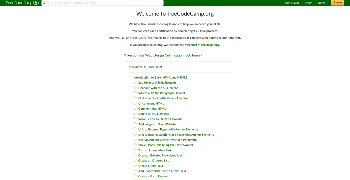
One platform that understands the significance of responsive web design is FreeCodeCamp. FreeCodeCamp is an online learning platform that offers free coding courses to help individuals learn web development skills. Their website is not only a treasure trove of coding resources but also a shining example of responsive design done right.
When you visit the FreeCodeCamp website on your desktop, you’ll notice how the layout seamlessly adjusts to fit your screen size. The content remains clear and legible, images scale appropriately, and navigation menus are easily accessible. This ensures that users have a consistent and user-friendly experience regardless of the device they’re using.
Responsive web design is not just about aesthetics; it also impacts user engagement and search engine rankings. Websites that are mobile-friendly tend to have lower bounce rates and higher conversion rates, as they provide a more satisfying browsing experience for visitors.
By prioritising responsive design, FreeCodeCamp demonstrates its commitment to accessibility and user experience. They make learning to code accessible to everyone, regardless of the device they’re using. This inclusive approach not only benefits their users but also reflects positively on their brand as a whole.
In conclusion, responsive web design plays a pivotal role in shaping the online experience for users. Platforms like FreeCodeCamp set an excellent example of how implementing responsive design can enhance usability, engagement, and overall success in the digital landscape.
Exploring Responsive Web Design: Insights and Guidance from FreeCodeCamp
- What is responsive web design and why is it important?
- How does FreeCodeCamp incorporate responsive design on its website?
- What are the benefits of having a responsive website for users?
- Does FreeCodeCamp offer courses on responsive web design?
- Can you provide examples of successful responsive web designs on FreeCodeCamp?
- How can I improve my own website’s responsiveness following FreeCodeCamp’s example?
What is responsive web design and why is it important?
Responsive web design is a fundamental approach to building websites that ensures they adapt and display optimally across various devices and screen sizes. This technique involves creating flexible layouts, fluid images, and media queries to provide an optimal viewing experience for users, whether they are accessing the site on a desktop, laptop, tablet, or smartphone. The importance of responsive web design lies in its ability to enhance user experience by providing consistent functionality and readability across different devices. It not only improves accessibility but also boosts engagement, reduces bounce rates, and ultimately contributes to higher conversion rates. In today’s mobile-driven world, where users expect seamless browsing experiences regardless of the device they use, responsive web design has become a crucial aspect of modern web development practices.
How does FreeCodeCamp incorporate responsive design on its website?
FreeCodeCamp incorporates responsive design on its website by employing a fluid grid layout, flexible images, and media queries. The website’s layout adapts seamlessly to different screen sizes, ensuring that content remains readable and accessible across various devices. Images are scaled proportionally to fit the screen without losing quality, and media queries are used to adjust styling based on the device’s characteristics. By prioritising responsive design principles, FreeCodeCamp ensures that users have a consistent and user-friendly experience, whether they’re accessing the site on a desktop, laptop, tablet, or smartphone.
What are the benefits of having a responsive website for users?
Having a responsive website offers a multitude of benefits for users. Firstly, a responsive design ensures that the website adapts seamlessly to various screen sizes and devices, providing a consistent and user-friendly experience. This means that users can access the content they need easily, regardless of whether they are using a desktop computer, tablet, or smartphone. Additionally, responsive websites tend to load faster and have improved performance, enhancing user engagement and satisfaction. By prioritising responsiveness, websites like FreeCodeCamp demonstrate their commitment to accessibility and inclusivity, ultimately creating a more enjoyable browsing experience for all users.
Does FreeCodeCamp offer courses on responsive web design?
Yes, FreeCodeCamp offers comprehensive courses on responsive web design as part of its extensive curriculum. These courses are designed to equip learners with the knowledge and skills needed to create websites that adapt and respond effectively to various screen sizes and devices. By enrolling in FreeCodeCamp’s responsive web design courses, individuals can learn best practices, techniques, and tools to ensure that their websites provide a seamless user experience across desktops, laptops, smartphones, and tablets.
Can you provide examples of successful responsive web designs on FreeCodeCamp?
When seeking examples of successful responsive web designs on FreeCodeCamp, one can explore a myriad of projects that showcase the principles and benefits of responsive design. From interactive portfolios to dynamic e-commerce websites, FreeCodeCamp’s community members have crafted impressive creations that adapt seamlessly across various devices. These examples not only demonstrate technical proficiency but also highlight the importance of user-centric design in delivering engaging and accessible web experiences. By delving into these projects, learners can gain valuable insights into best practices and innovative approaches to responsive web design.
How can I improve my own website’s responsiveness following FreeCodeCamp’s example?
To enhance your website’s responsiveness following FreeCodeCamp’s example, start by prioritising a mobile-first approach. Ensure that your website’s layout and content are designed to be easily accessible and functional on smaller screens. Utilise flexible grids and media queries to adapt your design to different screen sizes. Optimise images for faster loading times on mobile devices and consider implementing touch-friendly navigation elements. Test your website across various devices and browsers to identify any issues and make necessary adjustments to deliver a seamless user experience. By following FreeCodeCamp’s lead in responsive web design, you can create a website that is not only visually appealing but also user-friendly across all devices.
Leave a Reply