The Art of Web and Mobile Design
Web and mobile design have become essential elements in today’s digital landscape. With the proliferation of smartphones and tablets, ensuring that your website or mobile app is visually appealing, user-friendly, and optimised for different devices is crucial for success.
When it comes to web design, factors such as layout, colour scheme, typography, and navigation play a significant role in creating a positive user experience. A well-designed website not only captures the attention of visitors but also guides them through the content seamlessly.
Responsive design is another key aspect of modern web design. With users accessing websites on various devices with different screen sizes, ensuring that your site adapts and displays correctly on all platforms is paramount. Responsive design allows for a consistent user experience across desktops, laptops, tablets, and smartphones.
Mobile design focuses on creating interfaces specifically tailored to the smaller screens of mobile devices. This involves simplifying navigation, optimising content for quick loading times, and prioritising essential information to enhance usability on-the-go.
Both web and mobile design require a deep understanding of user behaviour and preferences. Conducting user research, testing prototypes, and gathering feedback are essential steps in creating designs that resonate with your target audience.
In conclusion, mastering the art of web and mobile design is about combining creativity with functionality to deliver seamless experiences that engage users across different platforms. By staying abreast of design trends and best practices, you can ensure that your digital presence stands out in a crowded online world.
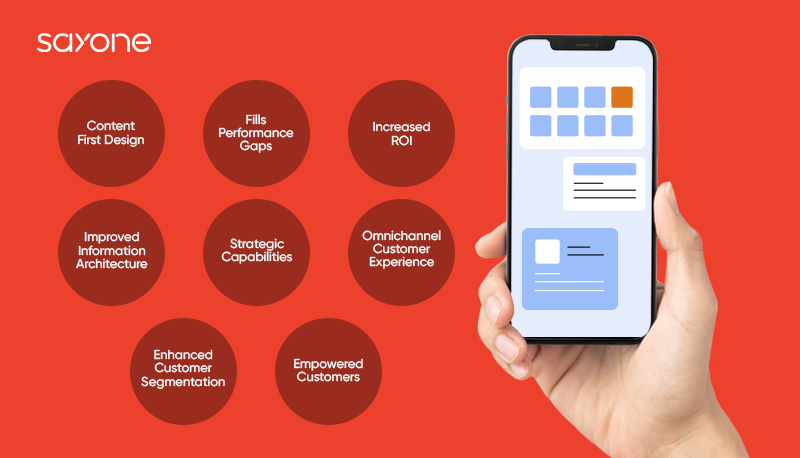
9 Key Benefits of Web and Mobile Design: Elevating User Experience and Brand Success
- Enhances user experience by providing intuitive navigation and visually appealing interfaces.
- Increases accessibility as users can access websites and apps on various devices anytime, anywhere.
- Boosts brand credibility and professionalism through well-designed digital assets.
- Improves conversion rates by creating engaging and user-friendly interfaces that encourage action.
- Facilitates better SEO performance with responsive design that enhances search engine visibility.
- Allows for seamless integration of multimedia content to engage users effectively.
- Enables faster loading times, reducing bounce rates and keeping users engaged longer.
- Supports scalability, making it easier to expand or update websites and apps as needed.
- Enhances customer satisfaction by delivering a consistent experience across different devices.
Challenges in Web and Mobile Design: Navigating Compatibility, Speed, Space, and Distractions
Enhances user experience by providing intuitive navigation and visually appealing interfaces.
Web and mobile design excels in enhancing user experience by offering intuitive navigation and visually appealing interfaces. By prioritising ease of use and aesthetics, designers can create seamless experiences that captivate users from the moment they land on a website or open a mobile app. Intuitive navigation ensures that users can effortlessly find the information they seek, while visually appealing interfaces engage them on a deeper level, making their interaction with the digital product not just functional but also enjoyable. This focus on user experience ultimately leads to increased engagement, higher retention rates, and overall customer satisfaction.
Increases accessibility as users can access websites and apps on various devices anytime, anywhere.
One of the key advantages of web and mobile design is its ability to enhance accessibility for users, allowing them to access websites and apps on a multitude of devices at any time and from anywhere. This flexibility empowers users to engage with content on their terms, whether they are on a desktop computer, a tablet, or a smartphone, ensuring seamless interaction and usability across different platforms.
Boosts brand credibility and professionalism through well-designed digital assets.
An often overlooked but crucial benefit of web and mobile design is its ability to elevate brand credibility and professionalism through meticulously crafted digital assets. A visually appealing and user-friendly website or mobile app not only attracts and engages users but also instils confidence in the brand, showcasing a commitment to quality and attention to detail. By investing in well-designed digital platforms, companies can establish a strong online presence that resonates with customers, reinforcing their trust and perception of the brand as reputable and reliable.
Improves conversion rates by creating engaging and user-friendly interfaces that encourage action.
One of the key benefits of web and mobile design is its ability to enhance conversion rates by developing engaging and user-friendly interfaces that prompt users to take action. By strategically placing calls-to-action, simplifying navigation, and optimising the overall user experience, well-designed websites and mobile apps can guide visitors towards desired actions, ultimately leading to increased conversions and achieving business objectives.
Facilitates better SEO performance with responsive design that enhances search engine visibility.
Responsive design in web and mobile design plays a crucial role in improving SEO performance by enhancing search engine visibility. Websites and mobile apps that are optimised for different devices through responsive design are more likely to rank higher in search engine results. This is because search engines prefer websites that provide a consistent user experience across various platforms, leading to increased organic traffic and better discoverability online. By prioritising responsive design, businesses can leverage this pro to boost their SEO efforts and reach a wider audience effectively.
Allows for seamless integration of multimedia content to engage users effectively.
Web and mobile design offers the invaluable advantage of enabling seamless integration of multimedia content to captivate and engage users effectively. By incorporating elements such as videos, images, animations, and audio into the design, businesses can create immersive experiences that resonate with their target audience. This multimedia-rich approach not only enhances user engagement but also helps convey information in a more dynamic and compelling manner, ultimately leading to a more memorable and impactful user experience.
Enables faster loading times, reducing bounce rates and keeping users engaged longer.
One significant advantage of web and mobile design is its ability to enable faster loading times, which ultimately leads to a reduction in bounce rates and keeps users engaged for longer periods. By optimising the design elements, such as images, scripts, and content delivery, websites and mobile apps can load swiftly, providing a seamless user experience. This not only improves user satisfaction but also increases the likelihood of users exploring more content and interacting with the site or app further.
Supports scalability, making it easier to expand or update websites and apps as needed.
One significant advantage of web and mobile design is its support for scalability, enabling seamless expansion and updates to websites and apps as required. By designing with scalability in mind, businesses can easily accommodate growth, add new features, or make necessary changes without compromising the overall user experience. This flexibility ensures that digital platforms remain dynamic and adaptable to evolving needs and technological advancements, ultimately enhancing longevity and relevance in a rapidly changing digital landscape.
Enhances customer satisfaction by delivering a consistent experience across different devices.
One of the key advantages of web and mobile design is its ability to enhance customer satisfaction by delivering a consistent experience across different devices. By ensuring that websites and mobile apps are optimised for various screen sizes and resolutions, users can seamlessly transition between desktops, laptops, tablets, and smartphones without encountering any usability issues. This consistency not only fosters trust and loyalty among customers but also reinforces the brand’s credibility and professionalism in the eyes of users.
1. Compatibility issues
One significant drawback of web and mobile design is the prevalence of compatibility issues. Ensuring a seamless experience across different web browsers and mobile devices poses a considerable challenge for designers. Variations in rendering engines, screen sizes, and operating systems can lead to discrepancies in how websites and apps appear and function. Addressing compatibility issues requires thorough testing and optimization to guarantee that users have a consistent experience regardless of the platform they are using. Failure to address these challenges can result in frustrated users, decreased engagement, and ultimately, a negative impact on the success of the digital product.
2. Loading times
Loading times can be a significant drawback in web and mobile design. Complex designs or heavy graphics, while visually appealing, can result in slow loading speeds that frustrate users and hinder their overall experience. In today’s fast-paced digital world, where attention spans are short and instant gratification is expected, delays in loading content can lead to high bounce rates and decreased user engagement. It is crucial for designers to strike a balance between aesthetics and performance to ensure that websites and mobile apps load quickly and smoothly, providing users with a seamless browsing experience.
3. Limited screen space
One significant drawback of web and mobile design is the limitation imposed by smaller screen sizes on mobile devices. Designing for these compact screens often poses a challenge as it restricts the amount of content that can be effectively displayed at once. This limitation requires designers to carefully prioritize and streamline information, making strategic decisions about what to include and how to present it in a concise and user-friendly manner. Balancing content visibility with a clutter-free layout becomes crucial in ensuring optimal user experience on mobile devices.
4. User distractions
In the realm of web and mobile design, a significant drawback lies in the potential for user distractions. The dynamic and fast-paced nature of these digital environments can often inundate users with an abundance of information, leading to feelings of being overwhelmed or easily distracted. With numerous elements vying for attention, such as pop-ups, notifications, and interactive features, users may struggle to stay focused on their intended tasks or goals. Designers must tread carefully to strike a balance between engaging content and avoiding excessive distractions that could hinder the user experience.
Leave a Reply