Exploring FreeCodeCamp’s Responsive Web Design Curriculum
FreeCodeCamp is a popular platform among aspiring web developers, offering a range of courses to help individuals enhance their coding skills. One of the key areas covered by FreeCodeCamp is responsive web design, which is essential in today’s digital landscape.
Responsive web design refers to the practice of creating websites that adapt and respond to different screen sizes and devices. With the increasing use of smartphones and tablets, it’s crucial for websites to be accessible and user-friendly across various platforms.
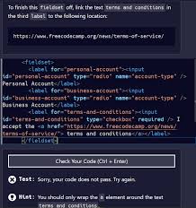
FreeCodeCamp’s responsive web design curriculum covers topics such as HTML5, CSS3, Flexbox, Grid, and more. Students are guided through practical exercises and projects that allow them to apply their knowledge in real-world scenarios.
By completing FreeCodeCamp’s responsive web design course, individuals can learn how to create fluid layouts, implement media queries for different screen sizes, and optimise images for faster loading times. These skills are invaluable for anyone looking to pursue a career in web development.
Moreover, FreeCodeCamp offers a supportive community where learners can seek help from peers and mentors. This collaborative environment fosters growth and encourages individuals to push their boundaries when it comes to mastering responsive web design concepts.
In conclusion, FreeCodeCamp’s responsive web design curriculum provides a comprehensive foundation for individuals looking to build responsive and user-centric websites. By honing their skills through practical projects and engaging with a vibrant community, learners can take their coding abilities to new heights.
Answers to Common Questions About FreeCodeCamp’s Responsive Web Design Course
- How do I create a responsive website design?
- Is freeCodeCamp enough to get a job?
- Is responsive design still relevant?
- Is responsive design difficult?
- How many hours is FreeCodeCamp responsive web design?
- What is responsive webdesign?
- What is responsive web design freeCodeCamp?
- How long does it take to finish freeCodeCamp responsive web design?
How do I create a responsive website design?
Creating a responsive website design involves a combination of strategic planning and technical implementation. To begin, it’s essential to design with a mobile-first approach, prioritising the user experience on smaller screens before scaling up to larger devices. Utilising CSS media queries is key to adapting the layout and styling of your website based on different screen sizes. Implementing flexible grids and images through techniques like Flexbox and Grid can help ensure that your content flows seamlessly across various devices. Testing your design on different devices and browsers is crucial to identify any potential issues and make necessary adjustments for optimal responsiveness. By following these steps and staying updated on best practices in responsive web design, you can create a website that provides a consistent and engaging user experience across all platforms.
Is freeCodeCamp enough to get a job?
One frequently asked question among FreeCodeCamp learners exploring responsive web design is whether completing the platform’s courses is sufficient to secure a job in the field. While FreeCodeCamp offers a robust curriculum that covers essential topics like HTML, CSS, and JavaScript, landing a job often requires additional skills and experience. It is important for aspiring web developers to supplement their learning with practical projects, internships, and continuous self-improvement. Networking within the industry and showcasing a strong portfolio of work can also significantly enhance one’s job prospects. Ultimately, while FreeCodeCamp is an excellent starting point, complementing it with further learning and hands-on experience is key to increasing employability in the competitive field of web development.
Is responsive design still relevant?
In the realm of web development, the question of whether responsive design remains relevant is a common one. The answer is a resounding yes. With the ever-increasing variety of devices used to access the internet, from smartphones and tablets to laptops and desktops, ensuring that websites are responsive and adaptable to different screen sizes is paramount. Responsive design not only enhances user experience by providing consistent functionality across devices but also plays a crucial role in search engine optimization and overall accessibility. As technology continues to evolve, responsive design remains a fundamental aspect of creating modern and user-friendly websites that cater to diverse audiences.
Is responsive design difficult?
When it comes to responsive web design, a frequently asked question is, “Is responsive design difficult?” The answer to this question can vary depending on an individual’s experience and familiarity with coding. While responsive design may seem daunting at first, especially for beginners, it becomes more manageable with practice and guidance. Platforms like FreeCodeCamp offer structured courses and resources that break down the concepts of responsive design into digestible chunks, making it easier for learners to grasp. By dedicating time and effort to understanding the principles behind responsive design and actively applying them in projects, individuals can overcome any initial challenges and gain confidence in creating websites that adapt seamlessly to different screen sizes.
How many hours is FreeCodeCamp responsive web design?
One frequently asked question regarding FreeCodeCamp’s responsive web design course is about the duration of the programme. The FreeCodeCamp responsive web design curriculum typically takes around 300 hours to complete. This estimate includes a series of interactive lessons, coding challenges, and projects designed to help learners grasp the fundamentals of responsive web design. By dedicating sufficient time and effort to the course, participants can acquire valuable skills in creating websites that adapt seamlessly across various devices and screen sizes.
What is responsive webdesign?
Responsive web design is a fundamental principle in modern web development that ensures websites are optimally displayed on various devices and screen sizes. In essence, responsive web design allows a website to adapt its layout and content dynamically, providing an optimal viewing experience for users across desktops, laptops, tablets, and smartphones. By utilising techniques such as flexible grids, media queries, and fluid images, responsive web design enables websites to maintain their functionality and aesthetic appeal regardless of the device being used. Embracing responsive web design is crucial in today’s digital landscape to cater to the diverse preferences and habits of users accessing websites on different platforms.
What is responsive web design freeCodeCamp?
Responsive web design on FreeCodeCamp refers to the practice of creating websites that can adapt and optimally display content across various devices and screen sizes. By mastering responsive web design principles through FreeCodeCamp’s curriculum, learners gain the skills needed to ensure their websites are visually appealing and functional on desktops, laptops, tablets, and smartphones. This includes understanding concepts such as fluid layouts, media queries, and flexible grids to create a seamless user experience regardless of the device being used. By delving into FreeCodeCamp’s responsive web design modules, individuals can learn how to build websites that are not only aesthetically pleasing but also accessible and user-friendly across different platforms.
How long does it take to finish freeCodeCamp responsive web design?
One common query among FreeCodeCamp learners interested in responsive web design is, “How long does it take to complete the FreeCodeCamp responsive web design course?” The duration to finish the course can vary depending on individual learning pace, prior experience with coding, and the amount of time dedicated to studying each day. While some learners may complete the course in a few weeks with consistent effort, others may take longer to grasp the concepts thoroughly. It’s important to focus on understanding the material rather than rushing through it, as building a strong foundation in responsive web design is key to mastering this essential skill set for web development.
Leave a Reply