The Iconic Apple Website Design: A Masterclass in Simplicity
When it comes to website design, few companies have achieved the level of recognition and acclaim that Apple has. The tech giant’s website is a masterclass in simplicity, elegance, and user experience.
One of the key features of Apple’s website design is its minimalist approach. Clean lines, ample white space, and a limited colour palette are hallmarks of their design aesthetic. This simplicity not only creates a visually appealing site but also enhances usability by reducing clutter and distractions.
Navigation on the Apple website is intuitive and seamless. Users can easily find what they’re looking for thanks to clear menu options and well-organised content. Whether you’re browsing for the latest iPhone or seeking support for your MacBook, the user journey is smooth and efficient.
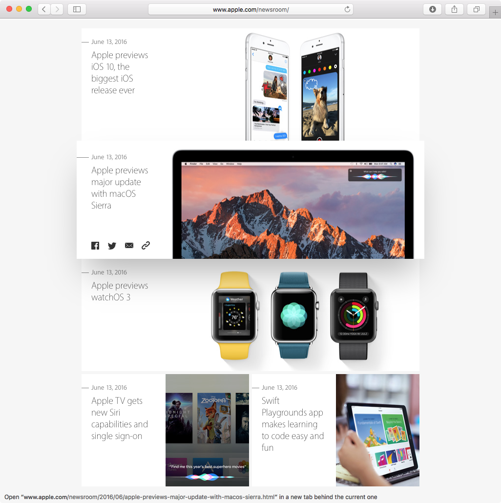
Another standout aspect of Apple’s website design is its focus on high-quality visuals. Stunning product photography, sleek animations, and engaging videos draw users in and showcase Apple’s products in the best possible light. The visual elements are not just eye-catching but also serve a functional purpose by conveying information effectively.
Accessibility is also a priority in Apple’s website design. The site is responsive across various devices and screen sizes, ensuring a consistent experience for all users. Clear typography, logical layout structures, and alt text for images further enhance accessibility for those with disabilities.
In conclusion, the Apple website design sets a gold standard for modern web design practices. Its combination of simplicity, functionality, aesthetics, and accessibility makes it a shining example of how to create an engaging online experience that resonates with users worldwide.
Seven Advantages of Apple’s Website Design: A Masterclass in User Experience
- 1. Clean and minimalist design enhances visual appeal.
- 2. Intuitive navigation for easy access to information.
- 3. High-quality visuals showcase products effectively.
- 4. Responsive design ensures a seamless experience across devices.
- 5. Accessibility features cater to users with diverse needs.
- 6. Consistent user interface for a cohesive browsing experience.
- 7. Engaging multimedia elements enhance user engagement.
Critiques of Apple’s Website Design: Limited Customisation, Visual Overload, and Minimalistic Challenges
- Limited customisation options for users
- High reliance on visuals may slow down loading times
- Some product information can be difficult to find due to minimalistic design
- Occasional lack of detailed technical specifications for products
- Limited interactivity and engagement features on the website
1. Clean and minimalist design enhances visual appeal.
The clean and minimalist design of the Apple website serves as a testament to the power of simplicity in enhancing visual appeal. By employing a restrained approach with clean lines, ample white space, and a limited colour palette, Apple creates a visually striking platform that captivates users with its elegance and sophistication. This uncluttered aesthetic not only showcases the products and content effectively but also provides a seamless and immersive browsing experience for visitors, allowing them to focus on what truly matters without distractions.
2. Intuitive navigation for easy access to information.
Apple’s website design excels in providing intuitive navigation that ensures easy access to information. With clear menu options and well-organised content, users can effortlessly find what they are looking for. Whether browsing for the latest products or seeking support, the user journey is seamless and efficient. This intuitive approach to navigation enhances the overall user experience, making it simple and straightforward to explore the site and access relevant information quickly.
3. High-quality visuals showcase products effectively.
One standout advantage of Apple’s website design is its emphasis on high-quality visuals to effectively showcase products. Through stunning product photography, sleek animations, and engaging videos, Apple’s website captures the essence of their products in a visually compelling manner. These visuals not only attract users’ attention but also provide them with a detailed and immersive look at the features and benefits of each product, ultimately enhancing the overall user experience and helping customers make informed purchasing decisions.
4. Responsive design ensures a seamless experience across devices.
Apple’s commitment to responsive design is a standout feature of their website, ensuring a seamless user experience across devices. Whether accessed on a desktop, tablet, or smartphone, the Apple website adapts effortlessly to different screen sizes and resolutions. This responsiveness not only enhances usability but also reflects Apple’s dedication to providing a consistent and user-friendly experience for visitors regardless of the device they are using.
5. Accessibility features cater to users with diverse needs.
The Apple website design excels in its commitment to accessibility, offering features that cater to users with diverse needs. By ensuring responsive design across various devices and screen sizes, Apple guarantees a seamless experience for all users. Clear typography and logical layout structures enhance readability, while the inclusion of alt text for images further supports those with disabilities. This dedication to accessibility not only reflects Apple’s ethos of inclusivity but also ensures that all users can navigate and engage with the website effectively, regardless of their individual requirements.
6. Consistent user interface for a cohesive browsing experience.
One notable advantage of Apple’s website design is the consistent user interface it offers, ensuring a cohesive browsing experience for visitors. By maintaining uniformity in design elements such as navigation menus, buttons, fonts, and colour schemes throughout the site, Apple creates a seamless journey for users as they explore different pages and sections. This consistency not only enhances user familiarity and comfort but also reinforces the brand’s identity and values across all touchpoints, contributing to a unified and engaging online experience.
7. Engaging multimedia elements enhance user engagement.
Apple’s website design excels in enhancing user engagement through engaging multimedia elements. By incorporating high-quality videos, interactive animations, and captivating product photography, Apple creates an immersive online experience that captivates visitors and encourages them to explore further. These multimedia elements not only showcase Apple’s products in a visually appealing way but also provide valuable information in a dynamic and engaging format, ultimately keeping users on the site longer and deepening their connection with the brand.
Limited customisation options for users
One notable drawback of the Apple website design is the limited customisation options available for users. Unlike some other websites that offer personalisation features allowing users to tailor their experience, Apple’s site provides minimal flexibility in terms of customising layouts, colours, or content preferences. This lack of customisation may lead to a less personalised user experience and could potentially hinder users who prefer a more tailored interaction with the site.
High reliance on visuals may slow down loading times
While Apple’s website design excels in its use of high-quality visuals to engage users, one potential drawback is the high reliance on these images and videos may lead to slower loading times. The abundance of rich media content, such as product images and animations, can increase the page size significantly, especially for users with slower internet connections or older devices. This could result in a less than optimal user experience for those who may face delays in accessing the website’s content due to extended loading times.
Some product information can be difficult to find due to minimalistic design
The minimalist design approach of the Apple website, while visually appealing and user-friendly in many aspects, can sometimes present a challenge when it comes to locating specific product information. With a focus on simplicity and clean aesthetics, certain details about products or services may be tucked away or not as prominently displayed, making it harder for users to quickly access the information they are seeking. This aspect of the design could potentially lead to frustration for users who require detailed specifications or features that are not immediately apparent, highlighting a drawback of prioritising minimalism over comprehensive content visibility.
Occasional lack of detailed technical specifications for products
One notable drawback of Apple’s website design is the occasional lack of detailed technical specifications provided for their products. While the website excels in presenting sleek visuals and user-friendly navigation, some users may find it challenging to access in-depth information about product specifications such as processor speed, RAM capacity, or camera features. This limitation can be frustrating for tech-savvy consumers who rely on detailed technical specifications to make informed purchasing decisions. A more comprehensive display of technical details could enhance the transparency and credibility of Apple’s product offerings on their website.
Limited interactivity and engagement features on the website
One notable drawback of the Apple website design is its limited interactivity and engagement features. While the site excels in simplicity and elegance, it may lack the dynamic elements that could enhance user engagement. Interactive tools, such as quizzes, configurators, or immersive experiences, are relatively scarce on the site. These features could potentially enrich the user experience by offering more interactive ways for visitors to explore Apple products and services. By incorporating more interactive elements, Apple could further captivate and retain visitors on their website, encouraging deeper exploration and interaction with their brand.
Leave a Reply