The Importance of Responsive Web Design Services
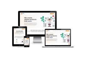
In today’s digital age, having a responsive website is crucial for businesses looking to establish a strong online presence. Responsive web design services play a vital role in ensuring that your website looks great and functions seamlessly across all devices, including desktops, laptops, tablets, and smartphones.
With the increasing use of mobile devices to access the internet, having a responsive website is no longer just an option – it’s a necessity. A responsive design allows your website to adapt to different screen sizes and resolutions, providing users with an optimal viewing experience regardless of the device they are using.
By investing in responsive web design services, you can improve user engagement and retention on your website. A responsive site ensures that visitors can easily navigate your content, access important information, and interact with your brand without any hassle. This leads to higher conversion rates and ultimately boosts your online presence.
Furthermore, search engines like Google favour responsive websites in their rankings. Having a responsive design can improve your site’s SEO performance and help you reach a wider audience online. This means that investing in responsive web design services not only enhances user experience but also improves your visibility in search engine results.
At our web design agency, we offer professional responsive web design services tailored to meet the unique needs of our clients. Our team of experienced designers and developers work closely with you to create a visually appealing and functional website that performs seamlessly across all devices.
Don’t miss out on the benefits of having a responsive website for your business. Contact us today to learn more about our responsive web design services and take your online presence to the next level!
9 Essential Tips for Enhancing Responsive Web Design Services
- Ensure your website design is mobile-friendly for better user experience.
- Prioritize loading speed to keep visitors engaged on all devices.
- Use responsive images and videos that adjust to different screen sizes.
- Optimise content layout for easy readability on various devices.
- Test your website across different browsers and devices regularly.
- Implement a flexible grid system to maintain consistency in design elements.
- Consider touch-friendly navigation for mobile users.
- Utilize CSS media queries to adapt styles based on screen size.
- Stay updated with the latest trends and technologies in responsive web design.
Ensure your website design is mobile-friendly for better user experience.
Ensuring that your website design is mobile-friendly is essential for providing a seamless user experience. With the increasing number of users accessing websites on their mobile devices, a mobile-friendly design allows visitors to easily navigate your site, access information quickly, and engage with your content effortlessly. By prioritising mobile responsiveness in your web design, you not only enhance user experience but also cater to the preferences of a diverse audience, ultimately leading to increased engagement and satisfaction among your website visitors.
Prioritize loading speed to keep visitors engaged on all devices.
When it comes to responsive web design services, prioritizing loading speed is paramount to keeping visitors engaged on all devices. In today’s fast-paced digital world, users expect websites to load quickly and seamlessly, regardless of the device they are using. By ensuring that your website loads swiftly on desktops, laptops, tablets, and smartphones, you can provide a positive user experience that encourages visitors to stay on your site longer and explore what you have to offer. Fast loading times not only enhance user engagement but also contribute to improved SEO performance and overall success of your online presence.
Use responsive images and videos that adjust to different screen sizes.
In the realm of responsive web design services, a key tip is to incorporate responsive images and videos that dynamically adjust to various screen sizes. By utilising this approach, websites can ensure that visual content remains crisp and engaging across different devices, enhancing the overall user experience. Responsive images and videos that adapt seamlessly to varying screen dimensions not only improve website aesthetics but also contribute to faster loading times and better performance, ultimately catering to a wider audience and reinforcing the site’s accessibility and usability.
Optimise content layout for easy readability on various devices.
To maximise the effectiveness of responsive web design services, it is essential to optimise the content layout for easy readability on various devices. Ensuring that text, images, and other elements are displayed in a clear and organised manner across different screen sizes enhances user experience and encourages engagement. By prioritising readability in the design process, businesses can deliver information effectively to their audience, regardless of the device they are using.
Test your website across different browsers and devices regularly.
To ensure the effectiveness of your responsive web design services, it is essential to regularly test your website across various browsers and devices. By conducting thorough testing, you can identify any potential issues or inconsistencies in how your site appears and functions on different platforms. This proactive approach not only helps maintain a seamless user experience but also ensures that your website remains accessible and user-friendly for all visitors, regardless of the device they are using to access it. Regular testing across multiple browsers and devices is key to delivering a consistent and high-quality online experience for your audience.
Implement a flexible grid system to maintain consistency in design elements.
When it comes to responsive web design services, implementing a flexible grid system is key to maintaining consistency in design elements across different devices. A flexible grid system allows for the seamless adaptation of layout and content based on the screen size, ensuring that your website looks cohesive and visually appealing on any device. By establishing a grid structure that can adjust fluidly, you can create a harmonious design that enhances user experience and reinforces your brand identity consistently across all platforms.
Consider touch-friendly navigation for mobile users.
When offering responsive web design services, it is essential to consider touch-friendly navigation for mobile users. Mobile devices rely on touchscreens for user interaction, so ensuring that navigation elements are easy to tap, swipe, and interact with is crucial for providing a seamless user experience. By implementing touch-friendly navigation techniques, such as larger buttons and intuitive gestures, you can enhance usability and engagement on mobile devices, ultimately improving the overall effectiveness of your website across different screen sizes.
Utilize CSS media queries to adapt styles based on screen size.
Utilizing CSS media queries is a key tip in responsive web design services as it allows websites to adapt their styles based on the screen size of the device being used. By implementing media queries, designers can create different layouts and adjust styling elements such as font sizes, spacing, and image sizes to ensure optimal viewing experiences across various devices. This approach not only enhances user experience but also demonstrates a commitment to providing a seamless and visually appealing website for visitors, regardless of the device they are using.
Stay updated with the latest trends and technologies in responsive web design.
To ensure the success of your website, it is essential to stay updated with the latest trends and technologies in responsive web design services. By keeping abreast of industry advancements, you can implement cutting-edge features and functionalities that enhance user experience and keep your site ahead of the curve. Embracing new trends and technologies in responsive web design allows you to create a modern, user-friendly website that resonates with your audience and drives engagement. Stay informed, adapt to changes, and watch your website thrive in the dynamic digital landscape.
Leave a Reply