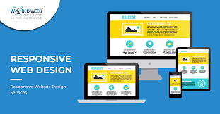
The Importance of Responsive Website Design Services
In today’s digital age, having a responsive website is crucial for businesses looking to reach their target audience effectively. A responsive website design service ensures that your website adapts to different screen sizes and devices, providing an optimal viewing experience for users.
With the increasing use of smartphones and tablets, more and more people are accessing websites on the go. A responsive design allows your website to be easily navigated on any device, whether it’s a desktop computer, a smartphone, or a tablet.
Not only does a responsive website improve user experience, but it also has a positive impact on search engine rankings. Search engines like Google prioritize mobile-friendly websites in their search results, meaning that having a responsive design can help boost your website’s visibility online.
By investing in responsive website design services, you are future-proofing your online presence. As new devices with varying screen sizes continue to emerge, having a responsive design ensures that your website remains accessible and user-friendly across all platforms.
Overall, responsive website design services are essential for businesses looking to stay competitive in today’s digital landscape. By providing an optimal user experience and improving search engine rankings, a responsive design can help drive traffic to your website and ultimately lead to increased conversions and sales.
Essential FAQs on Responsive Website Design Services for Your Business
- What is responsive website design?
- Why is responsive website design important?
- How does responsive website design benefit my business?
- What are the key features of a responsive website?
- How can I make my current website responsive?
- Do I need a separate mobile version of my website if it’s already responsive?
What is responsive website design?
Responsive website design is a modern approach to web design that focuses on creating websites capable of adapting to various screen sizes and devices. In essence, a responsive website is designed to provide an optimal viewing experience, ensuring that the content and layout adjust seamlessly to the user’s device, whether it’s a desktop computer, a smartphone, or a tablet. By employing responsive design techniques, websites can maintain functionality and visual appeal across different platforms, ultimately enhancing user experience and accessibility.
Why is responsive website design important?
Responsive website design is crucial in today’s digital landscape due to its ability to adapt to various screen sizes and devices. With the increasing use of smartphones and tablets for browsing the internet, having a responsive design ensures that your website provides an optimal viewing experience for users on any device. This not only enhances user experience but also boosts search engine rankings, as search engines favour mobile-friendly websites. By investing in responsive website design services, businesses can future-proof their online presence and ensure that their website remains accessible and user-friendly across different platforms, ultimately driving traffic, engagement, and conversions.
How does responsive website design benefit my business?
Responsive website design benefits your business in numerous ways. Firstly, it enhances user experience by ensuring that your website looks and functions optimally on all devices, including smartphones, tablets, and desktops. This leads to higher engagement levels and increased time spent on your site, ultimately boosting conversions and sales. Additionally, responsive design can improve your search engine rankings as search engines like Google favour mobile-friendly websites. By providing a seamless browsing experience across devices, responsive design helps to attract more traffic to your site and enhances your online visibility. Overall, investing in responsive website design services can significantly benefit your business by driving growth, increasing customer satisfaction, and staying ahead of the competition in the digital landscape.
What are the key features of a responsive website?
When it comes to responsive website design, key features are essential to ensure optimal user experience across various devices. A responsive website adapts fluidly to different screen sizes, maintaining readability and functionality. Flexible images and media allow content to resize proportionally without losing quality. Navigation menus are designed to be user-friendly on both desktop and mobile devices, ensuring easy access to all sections of the website. Additionally, responsive websites employ breakpoints to adjust layout and content based on the device’s screen size, providing a seamless browsing experience for users. These key features work together harmoniously to create a responsive website that is visually appealing, functional, and accessible on any device.
How can I make my current website responsive?
To make your current website responsive, you can start by conducting a thorough assessment of your website’s current design and functionality. Identify areas that need to be adjusted to ensure compatibility across various devices and screen sizes. Consider using a responsive web design framework or working with a professional web developer who specialises in responsive design services. Implementing a mobile-first approach, prioritising content hierarchy, and utilising flexible grids and media queries are key strategies in making your website responsive. Regular testing on different devices is essential to ensure that your website functions seamlessly across all platforms. By taking these steps, you can transform your current website into a responsive and user-friendly digital asset that caters to the needs of modern online audiences.
Do I need a separate mobile version of my website if it’s already responsive?
It’s a common misconception that having a responsive website means you also need a separate mobile version. In fact, the beauty of responsive design lies in its ability to adapt your website’s layout and content to different screen sizes seamlessly. With a responsive website, there’s no need for a separate mobile version as it ensures that your site functions optimally on all devices, providing a consistent user experience across the board. By embracing responsive website design services, you can streamline your online presence and reach your audience effectively without the need for multiple versions of your site.
Leave a Reply