
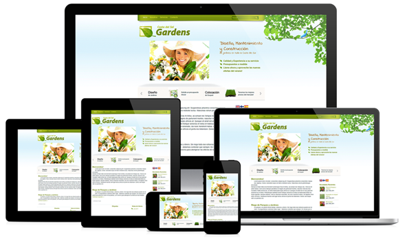
Adaptive Web Design: Enhancing User Experience Across Devices
In today’s digital age, where users access websites on a myriad of devices ranging from smartphones and tablets to desktops and laptops, it has become imperative for businesses to adopt adaptive web design. Adaptive web design is a dynamic approach that allows websites to adapt and provide an optimal user experience across various screen sizes and resolutions.
Unlike responsive web design, which adjusts the layout of a website based on the screen size, adaptive web design takes a more targeted approach by detecting the user’s device characteristics, such as screen size, operating system, and browser type. This enables the website to deliver a tailored experience that is specifically optimised for that particular device.
One of the key advantages of adaptive web design is its ability to enhance user engagement and retention. By providing a seamless browsing experience regardless of the device being used, businesses can ensure that users stay longer on their website and are more likely to convert into customers.
Moreover, adaptive web design can also have a positive impact on search engine optimisation (SEO). Search engines like Google favour websites that are mobile-friendly and provide a good user experience across all devices. By implementing adaptive web design practices, businesses can improve their search engine rankings and attract more organic traffic.
Ultimately, adaptive web design is not just about creating visually appealing websites; it’s about creating functional and user-centric experiences that drive results. As technology continues to evolve and new devices enter the market, businesses that embrace adaptive web design will be better positioned to succeed in an increasingly competitive digital landscape.
Top 5 Tips for Effective Adaptive Web Design: Ensuring Seamless User Experience Across Devices
- Prioritize mobile responsiveness for a seamless user experience on different devices.
- Use flexible grids and layouts to ensure content adapts well to various screen sizes.
- Optimize images and media for faster loading times on all devices.
- Implement CSS media queries to customize styles based on screen characteristics.
- Test your website across multiple devices and browsers to ensure consistent performance.
Prioritize mobile responsiveness for a seamless user experience on different devices.
To ensure a seamless user experience across various devices, prioritising mobile responsiveness is paramount in adaptive web design. By focusing on optimising the website for mobile devices first, businesses can guarantee that users have a smooth and intuitive browsing experience regardless of the device they are using. This approach not only enhances user engagement but also boosts accessibility and conversion rates, making it a crucial aspect of creating a successful and user-friendly website.
Use flexible grids and layouts to ensure content adapts well to various screen sizes.
When implementing adaptive web design, a crucial tip is to utilise flexible grids and layouts to guarantee that content adjusts seamlessly to different screen sizes. By employing flexible grids, designers can create a fluid and responsive structure that automatically resizes and repositions elements based on the user’s device. This approach ensures that the website maintains its visual appeal and readability across a diverse range of screens, enhancing the overall user experience and engagement.
Optimize images and media for faster loading times on all devices.
To enhance the performance of your website across various devices, it is crucial to optimise images and media for faster loading times. By reducing the file sizes of images and videos without compromising quality, you can ensure that your website loads quickly on smartphones, tablets, and desktops alike. This not only improves user experience by minimising wait times but also contributes to better search engine rankings, as fast-loading websites are favoured by search algorithms. Prioritising image and media optimisation as part of your adaptive web design strategy can significantly impact the overall efficiency and effectiveness of your online presence.
Implement CSS media queries to customize styles based on screen characteristics.
Implementing CSS media queries is a crucial tip in adaptive web design as it allows for the customisation of styles based on specific screen characteristics. By using media queries, web designers can create responsive layouts that adjust seamlessly to different screen sizes and resolutions. This approach ensures that the website’s design remains visually appealing and user-friendly across a variety of devices, enhancing the overall user experience. Media queries empower designers to tailor the presentation of content based on the device being used, ultimately contributing to a more adaptive and versatile web design solution.
Test your website across multiple devices and browsers to ensure consistent performance.
To maximise the effectiveness of adaptive web design, it is crucial to rigorously test your website across a variety of devices and browsers. By conducting thorough testing, you can identify any potential issues or inconsistencies in performance and ensure that your website delivers a consistent user experience across all platforms. This proactive approach not only enhances user satisfaction but also helps to build trust and credibility with your audience, ultimately leading to improved engagement and conversions.
Leave a Reply